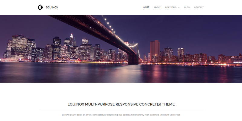
How to choose the look and feel of your website
I am writing this article to clarify a bit and to give, at the same time, food for thought on a topic that often generates doubts and, unfortunately, even some misunderstandings.
The graphic aspect of a website is one of the profiles that customers are most interested in defining and often constitutes reason for discussion between them and the webmaster about the results to be obtained.
In my opinion, this essentially depends on two reasons:
- aesthetic taste is, fortunately or unlucky, something strictly personal.
Although, in almost every sector, there are professionals who, having gained a certain experience in this regard, propose to dictate rules and dictates to follow (interior architects, stylists, graphic designers, etc.), each of us rightly reserves the right the right to have your opinion on what concerns us and on the purchases we intend to make.
For example, I hate (and the term hate is used in a way that is anything but casual) the fuchsia color. I have always hated him, for as long as I can remember.
Not even if Miuccia Prada were to reveal herself in front of me (for some absurd reason that I am not investigating now) and swore and perjure me that no other color would enhance my complexion better, would I be persuaded to buy a fuchsia sweater.
All this to say that even the undersigned, who understands very little about fashion, arrogates to herself the right to decide what she likes and what she doesn’t.
Nothing wrong with that as long as I make the purchases myself and don’t ask anyone for advice.
However, it would be different if I turned to an expert in the sector.
The above leads us to the second reason why I often believe that the graphic aspect is a reason for discord between the customer and the webmaster. - Often customers do not limit themselves to requesting that the site present certain details or requirements but, with the intention of creating something particular and outside the box, they try to overturn the standard rules that structure a professional site normally must have.
Returning to the example presented in point 1, if I hired a personal shopper to find an outfit in my place that would enhance me in a specific event, I think I would feel compelled to follow her opinion in some way.
Of course, the fact that the choice falls on something that I like and that respects my personality is a sine qua non.
However, when I ask a professional to do something for me, I assume that you are more competent than me in a given area, so I try to keep an open mind and generally follow her advice.
Therefore, if a webmaster advises against making a certain change, it is good to try to understand that you most likely have specific reasons for doing so, having a broader and more complete vision of the project as a whole.
In a website the graphics are not designed only in order to satisfy the aesthetic taste, but are designed in synergy with a series of aspects that have to do with the consultation and the usability of the site by users and with viewing from various devices (aspects which, by affecting the rate of abandonment from a site, can indirectly affect its positioning).
Consider that, in the era of mobile browsing, the site’s graphics must adapt to devices of various sizes and resolutions, some used with a mouse, others with a tach screen.
Not surprisingly, browsing it is possible to notice how many sites, on a graphic/structural level, resemble each other (for example the company logo is usually placed in the upper left corner and the navigation menu is usually located at the top of the screen or left side).
This does not depend on the laziness of web designers, but on the fact that years of web browsing have caused users to get used to surfing in a certain way.
Furthermore, various studies have shown how in a website it is possible to identify the cd. hot areas, i.e. the points where the visitor’s eye tends to fall; for example, one of these is represented by the upper left corner and it is no coincidence that, as anticipated, the logo is usually placed there. Therefore, I think it is advisable to stick to the normal development fees and, if you do not have a budget for a custom graphics studio, it is better to make something traditional but follow the guidelines in use.
If, on the contrary, you opt for a graphic studio you can afford to try to create something more outside the box, as long as the elements are not placed at random and behind the positioning of each of them there is an analysis.
But let’s get to the point: how are the graphics of a website created?
Do you want to know how to increase visits to your website?
Book a free appointment online now.
In general, there are two ways to go:
- You can start from a graphic theme (template).
Let’s make a necessary introduction to all this.
Most sites are currently created using a CMS (Content Management System), which is a software used to manage the site’s content.
If until a few years ago, developers created websites by writing code from start to finish, nowadays CMS have come to their rescue by speeding up their work.
Templates are developed for each CMS, i.e. graphic themes conceived, created and marketed by web designers.
Using a template has the following advantages:
a) they tend to be customizable.
Some of the elements are movable and editable in color.
What has been said obviously has limits, the extent of which largely depends on the CMS and the template used.
b) are ready and viewable (many of them also have live demos, which allow you to browse them like a real website)
c) have limited costs.
Here too what has been said in point a) applies. The costs depend on the CMS used but I don’t think I’m wrong in stating that, with some rare exceptions, they range from 20 to 100 euros.
Obviously, there are also several free templates which, however, are generally a little less accurate and have fewer graphic effects.
d) they do not require further development times: having already been created, it is sufficient to install them and modify them in content and colors to adapt them to the customer’s needs.
The website created using templates can therefore go online, in principle, in less time than one that does not use them.
However, I would like to give you some advice: make some changes where possible, but respect the structure. Because?
a) Because behind each template there is a graphic studio therefore, by making too large changes you risk losing the harmony of the elements that was conceived by its creator .
If the template does not satisfy you, I think it is preferable to change it with one that best suits your tastes rather than distorting its essence.
b) because if I ask the webmaster to make too substantial changes to a template and as a rule I will pay him for the work done, I will lose the economic advantage pursued by using a “ready” look. - Alternatively, it is possible to opt for a personalized graphic studio, the costs of which must be quantified on a case-by-case basis.
The advantages of this choice can be summarized as follows:
a) every detail can be inserted (after adequate analysis) and you are not bound to a predefined model
b) various graphic drafts are presented from which the customer can choose, also deciding if and which changes to make before the creation of the site (and not in progress, as often happens in the case of a template)
c) the product tends to be unique.
Notwithstanding the fact that most web designers follow the implementation canons mentioned above, the result is usually less standardized.
The disadvantages certainly concern:
a) the costs.
It is not possible to quantify them in this article because, as anticipated, they must be calculated from time to time depending on the project commissioned, but it is certain that they will greatly exceed those of purchasing a template.
b) realization times.
Even working at a good pace, creating the graphic layout of a site from start to finish will require longer development times.
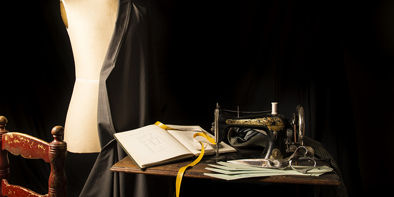
Usually, when talking to a client, I take the following as an example.
The choice between the use of a template and the development of a customized graphic design is comparable to that between the purchase of a ready-made outfit in any shop and the creation of a tailor-made suit by a seamstress.
Buying a ready-made suit does not exclude having purchased a quality garment just as using a graphic template does not exclude having a professional website, but perhaps imposes some small compromise not being totally customizable in every element.
Ultimately, as often happens, there is no right and wrong choice.
It all depends on the starting situation and the results to be pursued.
My advice is the following: if a project is at an early stage or you are not a large company or you do not have the energy and resources to start with a project of nexcellent entity I suggest the use of a template.
On the contrary, when it is necessary to create the institutional website of a large company or projects that are born full-bodied or that become so over time, it is essential to create a “made-to-measure suit” or proceed with a subsequent personalized graphic restyling.