Check if your website is optimized for mobile devices

The world of the internet, whether we are talking about the contents stored in it rather than the technologies used for their use, is in constant evolution and progress.
Thanks to the enormous diffusion of tools such as smartphones and tablets in recent years, the devices used for navigation are increasingly portable and intuitive.

According to some estimates accredited by 2020, 70% of the population will be connected to the network via mobile devices and this makes it essential right now to have a responsive website that is suitable for any type of tool used by the user during consultation.

Google itself informs us that users are five times more likely to abandon a website that is not optimized for mobile devices; consequently, if you do not want to risk losing visitors and potential customers, it is better to adapt the project to the new standards.

If you are not sure if your site is responsive or not you can do a quick test using the following service offered by Google:

Find out how your site works on mobile and desktop devices.

Do you want to know how to increase visits to your website?

Book a free appointment online now.

Enter the url of your site and press the “Try now” button

The product report will offer you interesting information on:

  • optimization for mobile devices
  • speed on mobile devices
  • speed on desktop


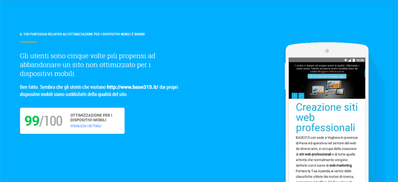
Below you will find an example of a test carried out on our site.

For webmasters or for those who manage the site themselves, this service is available

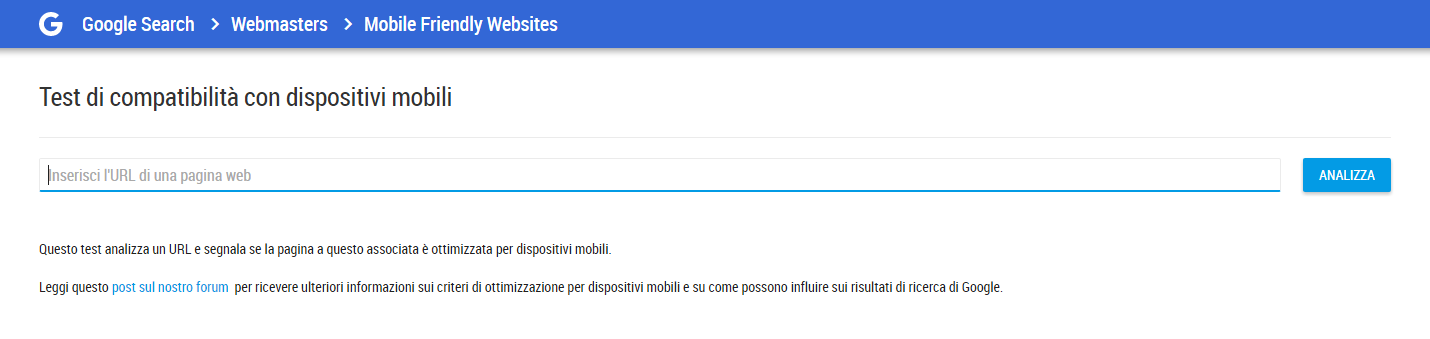
Compatibility test with mobile devices

Share post

Related articles

Sign up to our newsletter

Always stay up to date

logo-base315-2021

Request information

Using the form you can request information for free. A member of our staff will email you back to discuss your needs, goals, and any web-related issues you intend to solve.